
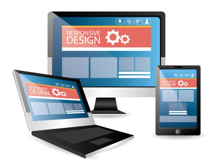
Responsive web design pulls together graphic design, interface design, UX design and SEO, with the focus kept on user experience rather than just the underlying software. We work across three main types: RWD (media queries that shrink the site to fit different screens), adaptive design (device-specific optimisation for iPad, iPhone, tablet) and fluid design (percentage-based widths that scale naturally).
The benefits compound: faster mobile development, lower bounce rates, higher conversion, better analytics tracking, and lower long-term maintenance costs since you're maintaining one site instead of two.
We've built responsive sites across industries — food delivery, healthcare, ticket booking — tailored to every screen size a business actually needs to reach, from Kindle to Smartphone.